Welcome to the 8th edition of the Ideas on Design Digest! This time, we’ll be covering several design topics related to the Olympics. If you missed the last edition, you can read it here.
The Olympics are over, and the 5 iconic rings won’t be making a return until LA in 2028. Then, as it happens with every edition, we can expect a fresh new look inspired by the hosting city. Historically, this inspiration has ranged from very subtle references of place to the more obvious clichés.
With this year's edition in Paris, it was rather the latter. The whole visual language was a full-blown celebration of Art Deco and Marianne (or female hairstyles of the 20s). It all looked great, from the graphical patterns to the typography and pictograms. But somehow, it also overshadowed the global Olympic brand.
Far from me to criticize this approach. I’m certain it plays an important role in the success of the Olympics. But I can't help but wonder: what if, for once, the Olympic brand took the center stage instead, completely immersing the hosting city in the five Olympic colors, rings, and its global message of unity and fellowship?
Other things on my mind:
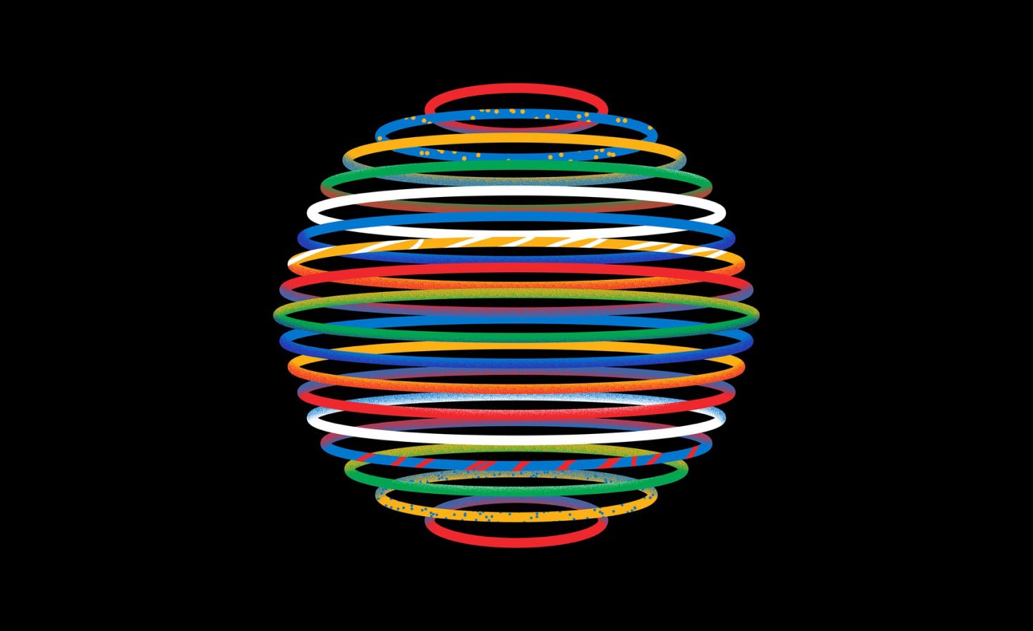
The new graphic charter of the Olympic Games
Between 2019 and 2023, the now defunct Canadian agency Hulse & Durrell worked on the global identity of the Olympic Games, with the goal of creating a more cohesive visual identity. I really like the Swiss Style–esque layouts, and how the vibrant illustrations seem to refer to the classical Olympic pictograms.
→ See project
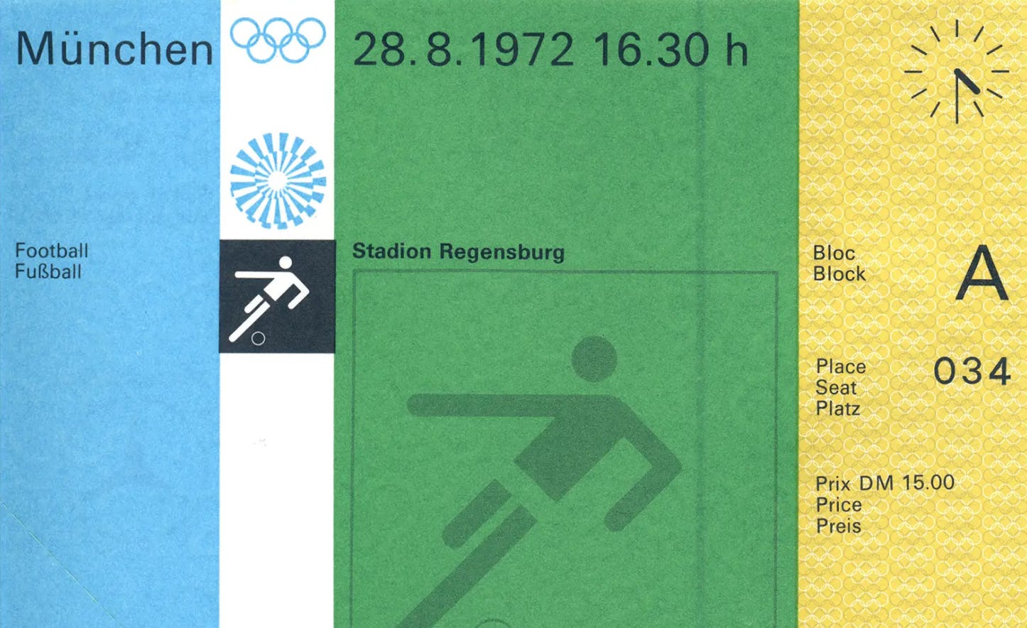
Munich 72 Collected
The Olympic Games of 1972 in Munich were by far the most beautiful in terms of graphic design. As you can see in the gallery linked below, everything felt so pure and thoughtful, especially when compared to today's standards where everything is extremely loud. It really doesn’t surprise me to learn that the team led by Otl Aicher was huge – 82 graphic designers, illustrators and other technical staff.
→ See gallery
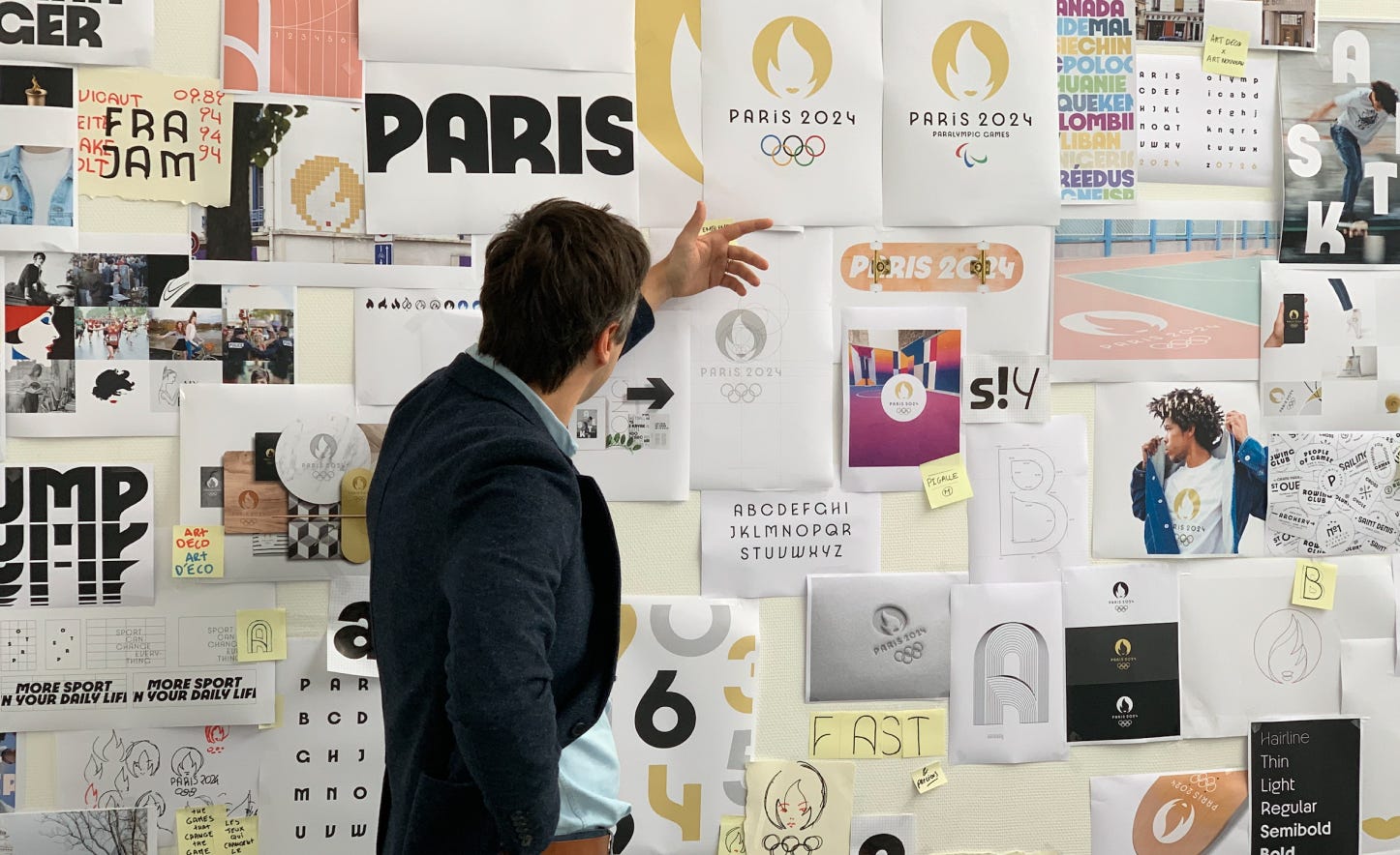
The story behind the (2024) Paris Olympic Logo
In this article, the French designer Sylvain Boyer discusses the process of creating the logo for the Paris Olympic Games. He talks about designing the logo in 2018 amidst the Paris constant protests, how it was inspired by the work of René Gruau, and the significance of including a female symbol in the logo.
→ Read article
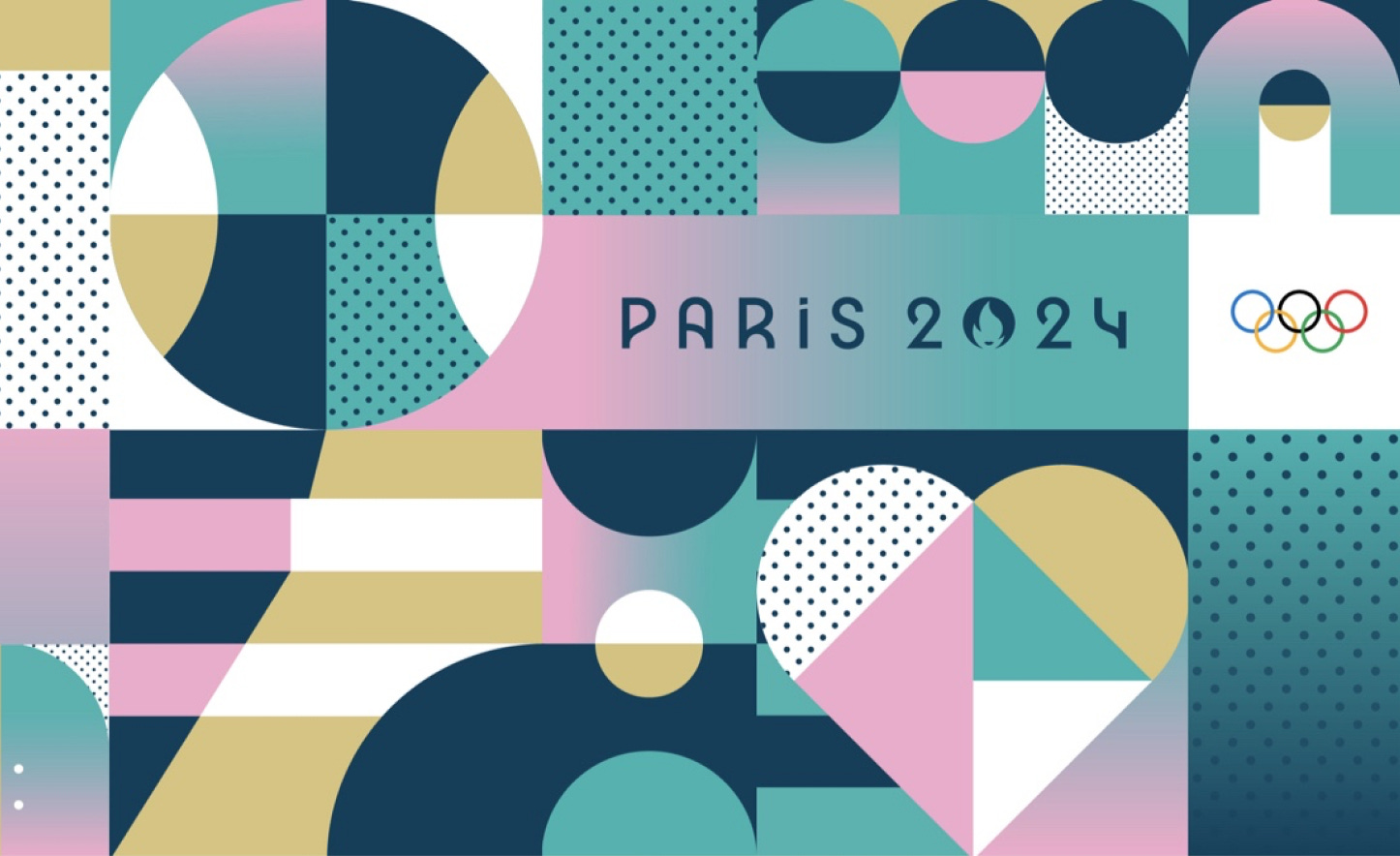
Branding the Paris Olympics
Conrad Design Group was responsible for creating the visual identity for the Paris 2024 Olympics, with the exception of the logo and custom typeface. The result, a celebration of the Parisian aesthetic of the 20s, worked really well. Especially when it comes to the the Art Deco influenced graphical patterns that were used everywhere. The only thing that I don’t like as much, is how they abandoned the traditional pictograms for crest-like symmetrical compositions. They look good, but are very difficult to understand.
→ See project
YouTube Yoodles for Paris 2024
Anyways Creative worked with illustrators from around the world to create a set of beautifully animated Yoodles for the Paris 2024 Olympics. I honestly didn’t know that YouTube had their own version of Google Doodles. Yoodles seem to serve the same purpose, celebrating important cultural moments, but aren’t as influenced by the logo as their Google counterpart.
→ See project
Jobs: Picks of the Month
And before I leave you, here are some interesting open positions I found this month:
Buck - Brand Creative Director (US, LA or NYC)
Buck - Senior Brand Designer (US, LA or NYC)
Vercel - Senior Brand Designer (US, EU, Remote)
DoorDash - Senior Brand Strategist (US)
Gharage - Head of Creative and Strategy (Hamburg, Germany)


That global identity is nice 😍
The Munich 72' gallery is great. The older I get the more I come to appreciate the designs from years before my time.