Welcome to the 6th edition of the Ideas on Design Digest! Last time, I wrote about the power of words in design. I also shared some interesting reads, like the Brand Names Report, or IKEA‘s innovation lab SPACE10. If you missed it, you can read it here.
The Portuguese government decided to revert back to its old logo, just 4 months after introducing a new one (you can find the abandoned guidelines here, courtesy of the Internet Archive). The introduction of the now discarded logo became highly politicized and unfortunately, in my opinion, didn't survive the change in government or the mixed reactions on social media.
It reminds me of GAP, which in 2010 introduced a new logo but then reverted back to their old one just 6 days later due to negative feedback on social media. I was personally not a fan of the new one, but the uncomplicated use of Helvetica, versus the uppercase serif, would have been a good match to their communication style and personality (see the Kakhi Swing commercial for a reference).
I don’t think organisations change just for the sake of change. There is typically a plan and a vision. And instead of being swayed by social media and non-representative discussions about personal preferences, those leading change initiatives should rather stay focused on the original vision and why they decided to change things in the first place.
People tend to resist change, but as many controversial changes show us, at some point change becomes normal, right?
Other things on my mind:
Curiosity: CIA used modern art against communism
Can you believe that during the Cold War, the CIA used American modern art as a weapon against communism? In the 50s and 60s, artists like Jackson Pollock were promoted by the CIA in an effort to influence political ideologies and celebrate intellectual freedom and creativity, in opposition to Russian art that was highly restricted by the communist ideology. What a cool movie this story would make.
→ Read Modern art was CIA 'weapon'
Inspiration: The Lettering from Simon Walker
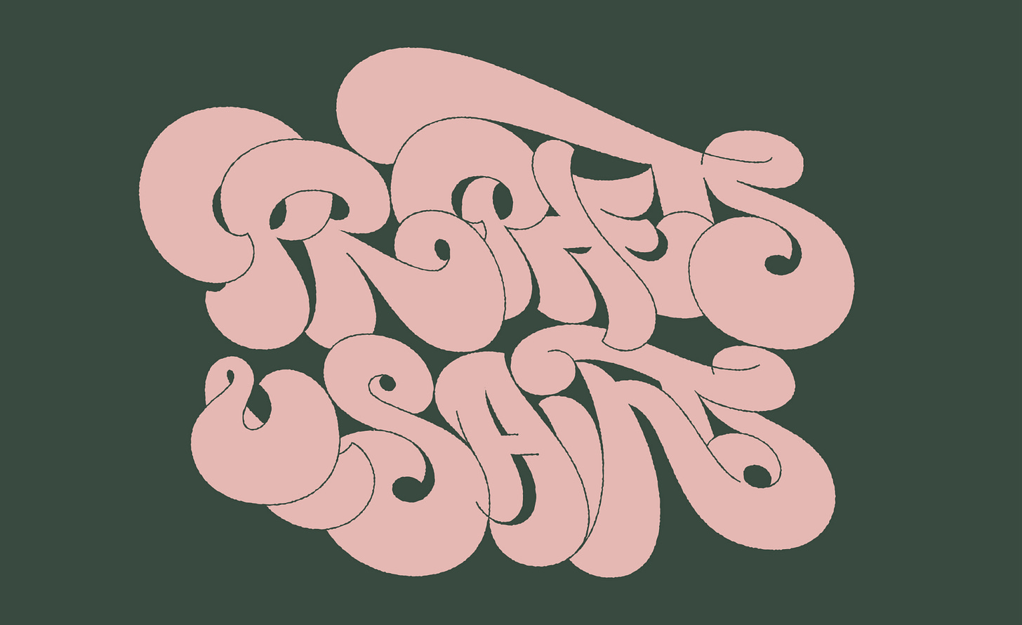
Simon Walker is a master of custom lettering. Known for bespoke lettering and an expressive style, his work has been influenced by an early fascination with graffiti and hip-hop culture. I love his recent collaborations with designers such as Mike Smith from Smith&Diction, or his older work for Austin Eastciders.
→ Simon Letters studio
→ Austin Eastciders by Simon Walker
Project spotlight: Decathlon by Wolff Olins
I'm not very sporty, but I'm an absolute fan of Decathlon. I'm happy to see that they're finally caring for their brand and placing it in the foreground, with the help of the agency Wolff Olins. And moving forward, hopefully we see less Tribord, less Quechua, and more Decathlon.
→ See case study by Wolff Olins
Book: Profiles of the Future
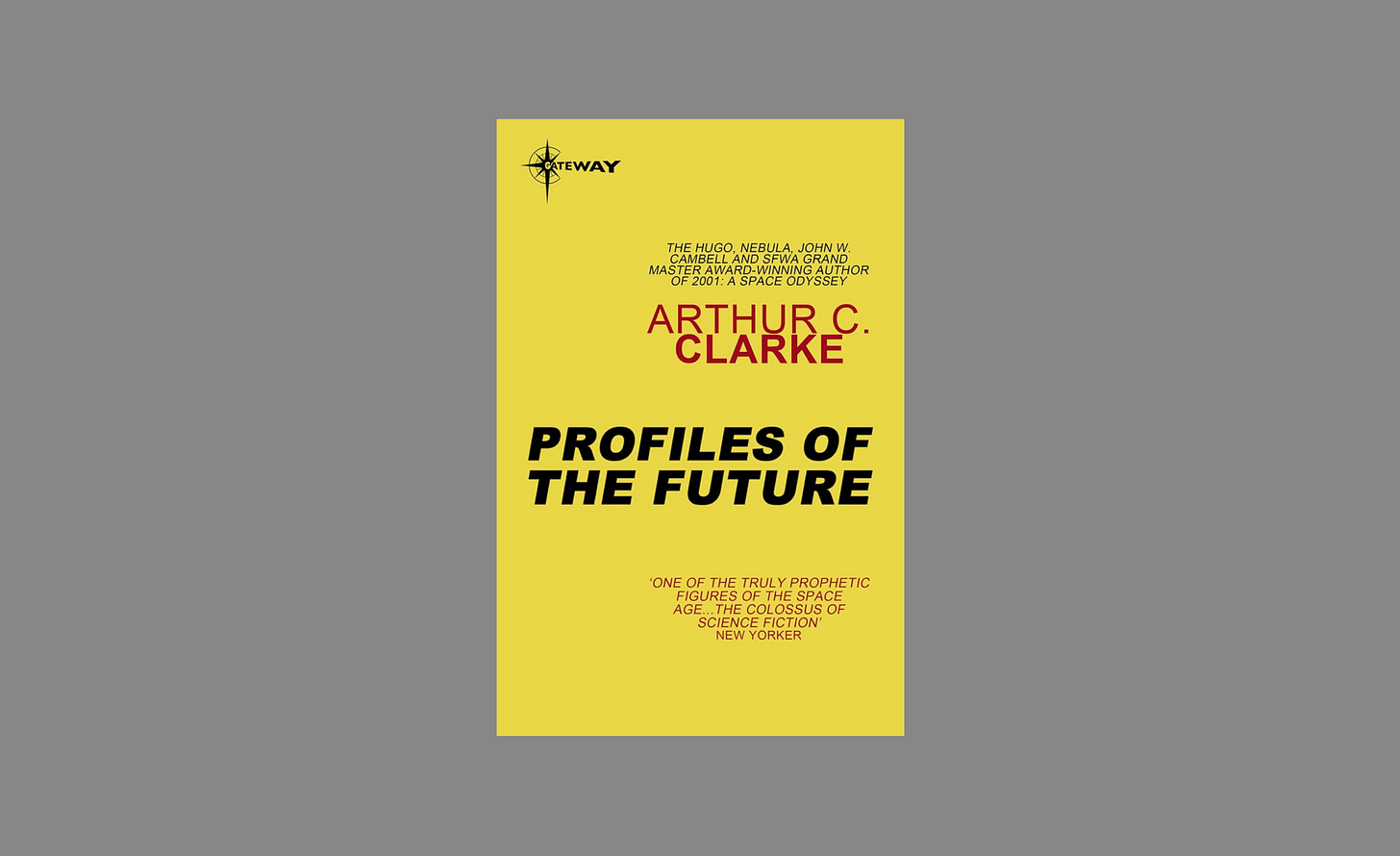
There is something about trying to predict the future that I find fascinating, especially when done with a certain naïveté and a touch of optimism. Maybe because design has a lot to do with that: exploring potentially better futures. And on that note, I’ll leave here the recommendation of a book I started recently, Profiles of the Future, by the futurist and scriptwriter of 2001: Space Odyssey, Arthur C. Clarke.
→ Profiles of the Future on Amazon
AI developments: Figure01
Figure01 is a general-purpose humanoid developed by FigureAI and powered by OpenAI. It's incredible how it feels different, and much more human than previous humanoids designed by competing companies, like Boston Dynamics. In my opinion, it is mostly due to its speech capabilities, but also in how it uses pauses and fillers just like we would. You can notice this in the moment when the humanoid is asked why it did what it did, and answers with: "I gave you the apple because it's the only ‘uh’ edible item I could provide you with from the table". Crazy times...


Hi David,
I really like reading your articles and hearing your point of view regarding design topics. Keep going!