Type doesn't matter. Does it?
Is typography falling out of grace? Or does it still play a fundamental role today?
I’ve always been a type nerd.
During my studies I used to buy typefaces with the little money I had. I can still remember the first one. Plexes, by the Portuguese type designer Dino dos Santos. I thought its character was a good fit for an assignment I was working on at the University. To be honest, looking back I’m not sure it was.
Back then, we were taught that typography was the foundation of graphic design. One of the most, if not the most, important aspects for graphic communication. We learned that legibility is important. That typography can give texts character and personality. That it can reinforce brand recognition. We learned how to design typefaces, and also how to use them with intent.
Later, in my first job as a Designer, the search for the perfect type didn’t stop. With each project there was an urgency to find the most fitting typeface. The one that could best express the character of the brand. Be the perfect match for a logomark. Or even, improve the readability for an information piece.
Today, unfortunately typography seems to be falling out of grace. I’ve seen well known designers publicly disregard the importance of type. Maybe a consequence of a time when system fonts were always forced upon us, they make the case that any good font is good enough.
I find it saddening, and also a missed opportunity. Products, services, websites, are an integral part of a brand’s experience. Even in digital interactions, typography can aid brand recognition. It can influence how a brand is perceived by the user. It can make up for a more effective brand experience.
But nothing puts it in perspective like looking at a few examples of brands that have done it successfully and with intent.
Mercedes — Corporate
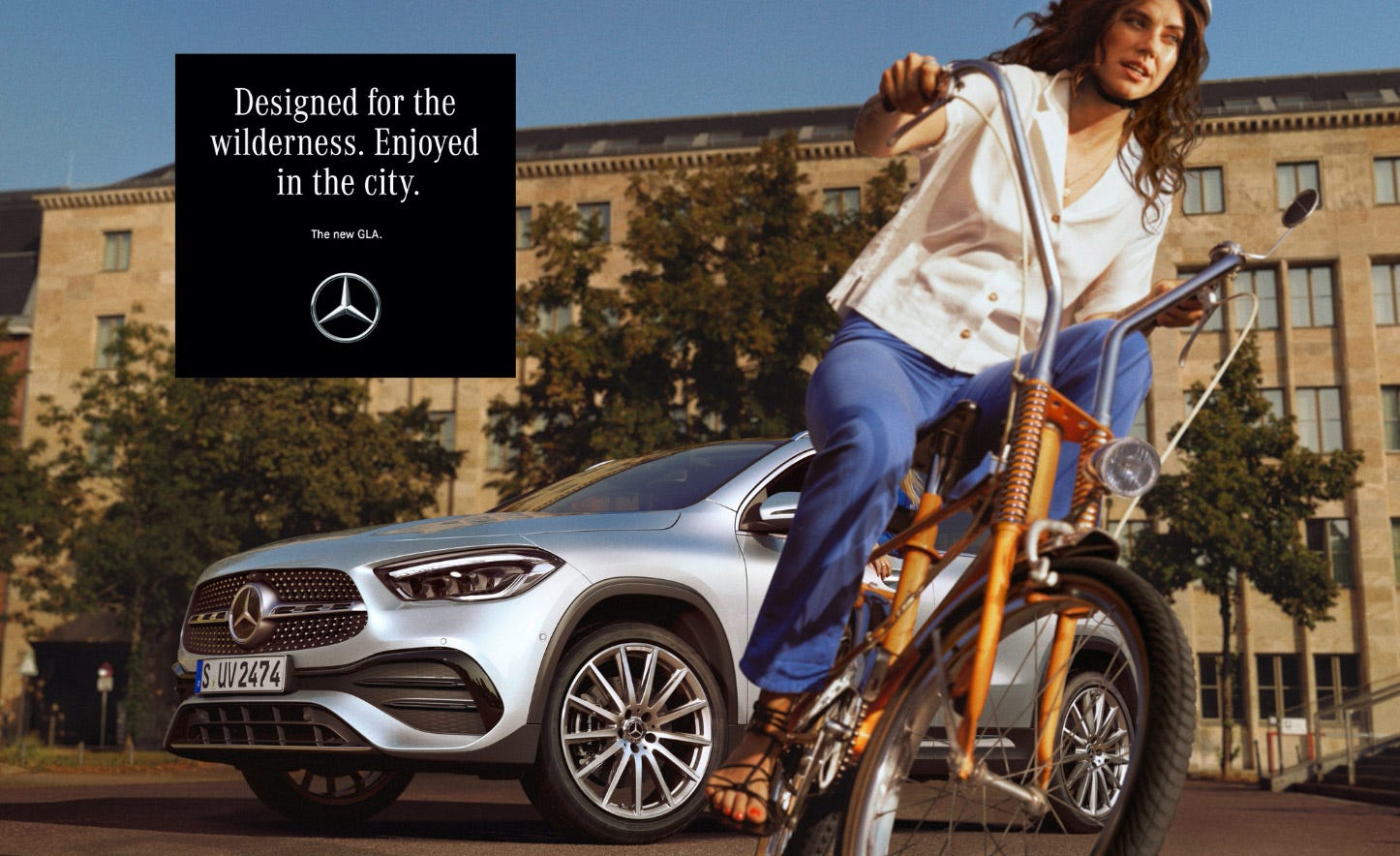
The “Corporate” font, designed by the German typographer Kurt Weidemann is instantly recognisable. It exudes prestige and history, attributes that seem fitting for a brand like Mercedes. Whenever I see the elegant condensed serif type in combination with a black background, I instantly know it is Mercedes. Today Mercedes uses the “Mercedes Benz Corpo” typeface, which I guess is an optimised version of the “Corporate” typeface.
Ericsson — Hilda
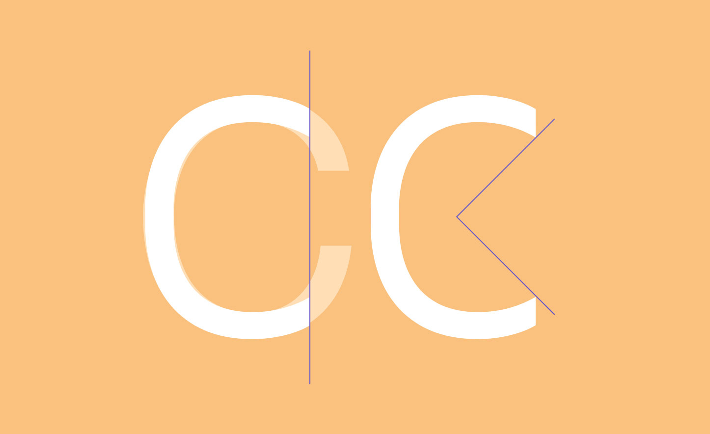
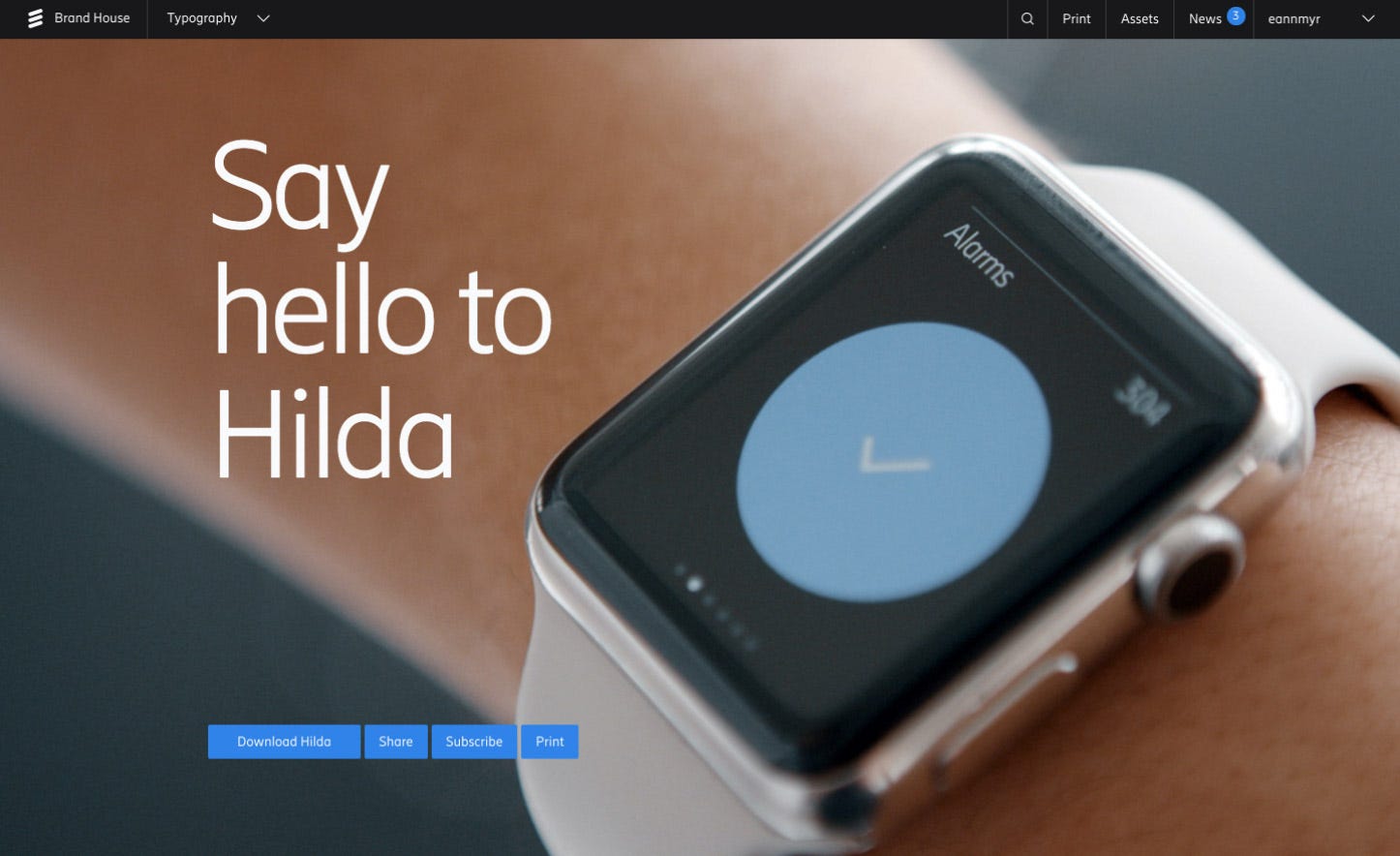
Hilda is a modern bespoke typeface by Letters from Sweden. It was designed with a focus on digital applications. Functionality and clarity first, with many features and details that are meant to improve screen performance (vertical terminals, a slashed Zero, a distinctive “I”). Hilda is a font that stands for technical expertise, but it is not cold or neutral. On the contrary, Hilda is distinctive. It has a friendly character that perfectly reflects Ericsson’s brand promise “The quest for easy”.
Match — Reckless Neue
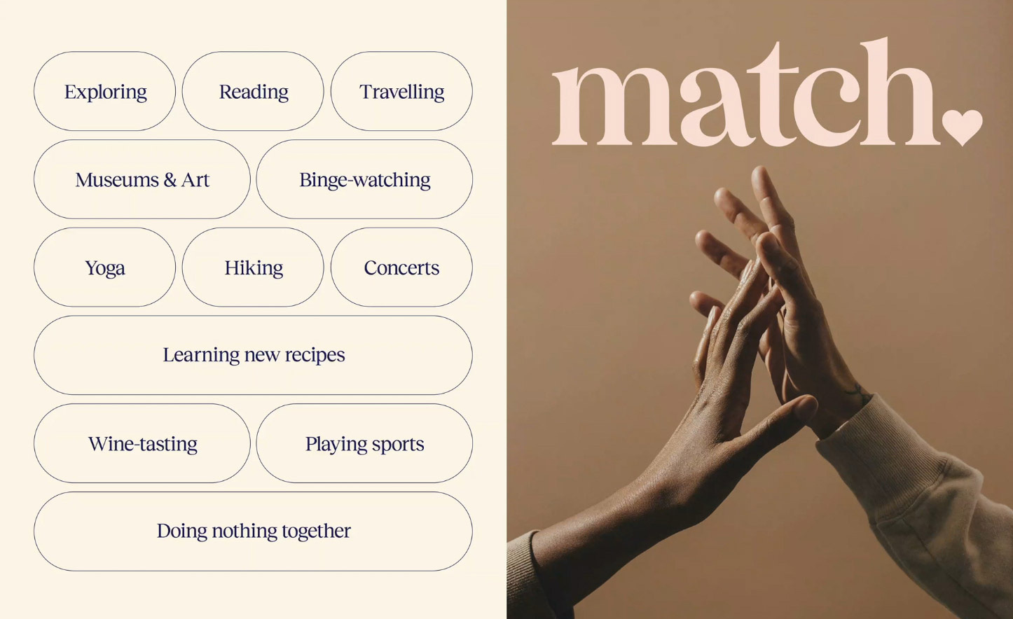
Typography has the power to convey brand values through the choice of letter shape. That’s what Collins did in the visual identity they developed for Match, an online dating service. In a sector characterised by products that are no more than a means to an end, Match is a breath of fresh hair. It feels inviting, playful, intimate. And the Typography plays a major role. “Reckless Neue”, is an elegant typeface that hints to Romanticism. Even the logo wordmark (based on “Wulkan Display”) hints at connection, with the “a” leaning towards the “m”. It’s about finding love, not a one night stand.
Times have definitely changed, but typography still matters.
It mattered before digital, but it still matters a lot today.
Thank you for reading!
David


